

AI data analysis now covers more than asking a chatbot to explain a spreadsheet. Some tools turn clean data into answers, dashboards, and forecasts. Others, like Prophecy, prepare, govern, and validate the data before analysis even starts.
This guide takes pricing directly from each vendor's own site, groups all 11 tools by the job each one does, and names a clear pick for the most common situations a team runs into.
11 best AI tools for data analysis: TL;DR
- Prophecy: Best for governed data preparation before analysis starts
- Microsoft Power BI Copilot: Best for Microsoft-native reporting teams
- Tableau Pulse: Best for proactive KPI monitoring and briefings
- ThoughtSpot: Best for search-based exploration on clean data
- Domo: Best for live operational monitoring
- Tellius: Best for investigating why a metric changed
- Dataiku: Best for enterprise ML and AI agents across a large organization
- DataRobot: Best for automated, repeatable prediction problems
- Julius AI: Best for fast, conversational file analysis
- Microsoft Copilot in Excel: Best for teams who live inside a spreadsheet
- ChatGPT: Best for ad hoc, code-based analysis
This guide groups all 11 by use case, checks current pricing from official sources, and flags which have a real free tier.
How this guide was researched
This guide draws on desk research from each vendor’s official product pages, documentation, help centers, and pricing pages. A uniform hands-on test was outside this research process.
Every published price came from the vendor’s own pricing page and was checked during research. We also reviewed feature access, plan limits, deployment requirements, and free-trial terms where vendors published them.
The review focused on four practical questions:
- Can the tool carry a question through real work? We looked beyond a prompt box for products that can investigate a result, run analysis, create an output, or prepare data for a later task.
- What data can it work with? File uploads, semantic models, warehouses, and business systems give tools different levels of context and access.
- Can we check its work? We looked for visible SQL, Python, filters, source data, metric definitions, workflow steps, or other evidence behind an answer.
- What does adoption involve? We considered the intended user, setup requirements, paid feature gates, pricing model, and governance needs.
The entries reflect product fit and published capabilities, not a single benchmark score. Your data model, permissions, and workflow will shape the result.
What is AI for data analysis?
AI for data analysis helps people explore and interpret data through plain-language questions. It can return charts, calculations, summaries, and explanations from a spreadsheet, database, dashboard, or data warehouse.
The difference between descriptive, predictive, and prescriptive analytics helps define what each tool can do.
Most tools on this list explain what happened. Fewer can forecast what happens next or recommend what to do.
11 AI tools for data analysis: Quick comparison
| Tool | Best for | Starting price | Free option |
|---|---|---|---|
| 1. Prophecy | Governed data preparation | $150/user/month | Free Starter tier |
| 2. Power BI Copilot | Microsoft-native reporting | Pro $14/user/month plus capacity | Free account, no Copilot |
| 3. Tableau Pulse | Proactive KPI monitoring and briefings | Creator $75/user/month | Trial only |
| 4. ThoughtSpot | Search-based exploration | $25/user/month | Trial only (free Developer plan is embedded-only) |
| 5. Domo | Live operational monitoring | Custom, credit-based | 30-day trial |
| 6. Tellius | Root-cause investigation | Custom quote | 30-day trial |
| 7. Dataiku | Enterprise ML and AI agents | Custom quote | Free Edition, 14-day trial |
| 8. DataRobot | Automated prediction models | Custom quote | 30-day trial |
| 9. Julius AI | Fast spreadsheet analysis | $20/month | Free plan |
| 10. Copilot in Excel | Spreadsheet-native analysis | $18/user/month promotional | Copilot Chat only |
| 11. ChatGPT | Ad hoc code-based analysis | $8/month | Free tier |
AI data preparation
Data preparation determines what every later analysis can trust. This category covers tools that clean, join, transform, and document data before it reaches a dashboard, model, or AI assistant.
1. Prophecy
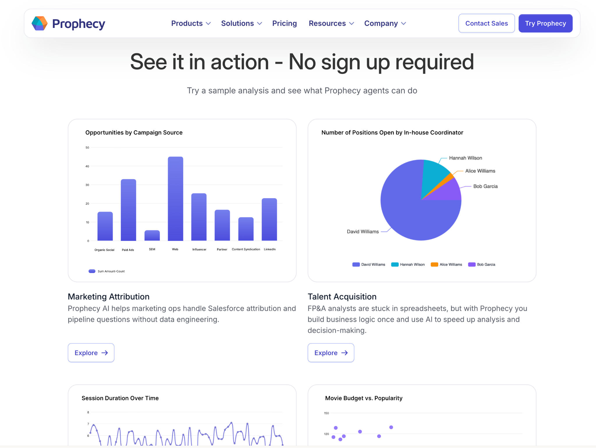
What it does: Prophecy turns a business goal into a visual data preparation workflow and supports analysis from the prepared data. Its AI agents work with Databricks, Snowflake, and BigQuery.
Best for: Data and analytics teams that need to clean, join, validate, and document data before it feeds dashboards, models, or other AI tools.
Prophecy prepares the data that later dashboards, models, and AI assistants rely on. An analyst can describe the dataset they need in plain language, then review and refine the visual workflow the agent drafts.
Prophecy compiles that workflow into a standard dbt project with warehouse-native SQL and commits it to your Git repository.
Key features
- Transform agent: Builds a visual workflow from a plain-language business goal.
- Visual review: Shows the joins, filters, and transformation steps behind the agent’s output.
- Data analysis: Generates insights and visualizations from validated prepared data.
- Documentation agent: Creates documentation for data workflows and their logic.
- Warehouse support: Professional plans process data in Databricks, Snowflake, and BigQuery.
Prophecy pros
- Users can inspect and refine the preparation logic before it reaches downstream reporting
- Prophecy links data preparation and analysis in the same workflow
- Teams can start with a visual workflow, then deploy the work as code
Prophecy cons
- Starter uses Prophecy’s embedded DuckDB environment and has compute limits
- Professional plan credits can create additional usage costs beyond the per-user price
- Teams with a trusted semantic model and a simple dashboard question may get faster answers from a BI assistant
What users say
Pro: “Prophecy has positively impacted my organization by greatly speeding up development time and providing capabilities of using DBT alongside functionalities associated with that, making it a very good tool to avoid coding much and utilize AI with the graphical tools available without needing to code.” (Konstantin G., PeerSpot review, July 16, 2026)
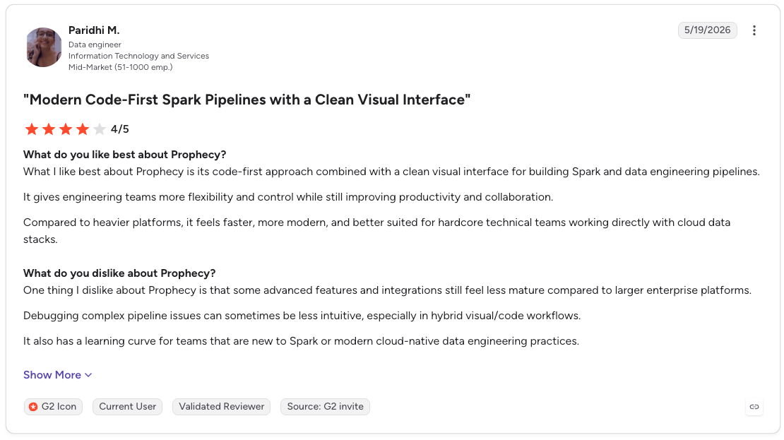
Con: “One thing I dislike about Prophecy is that some advanced features and integrations still feel less mature compared to larger enterprise platforms. Debugging complex pipeline issues can sometimes be less intuitive, especially in hybrid visual/code workflows.” (Paridhi M., G2 Review, May 19, 2026)
Pricing
Starter is free with 20 credits each month. Professional costs $150/user/month and includes 50 credits per user each month. Enterprise Express costs $4,000/month for up to 20 users, billed annually. Enterprise pricing is custom.
Bottom line
Prophecy helps when a bad dashboard answer leads back to a join, source, or undocumented rule. It gives data teams a visible workflow to check that logic before it reaches a dashboard or model. A one-off spreadsheet question calls for a lighter analysis tool.
AI tools for BI platforms
These tools add conversational analysis to a BI platform your team already uses. Their answers depend on the dashboards, metric definitions, and data model beneath them.
Check that the AI follows your business definitions, shows its filters, and handles follow-up questions without changing the metric.
2. Microsoft Power BI Copilot
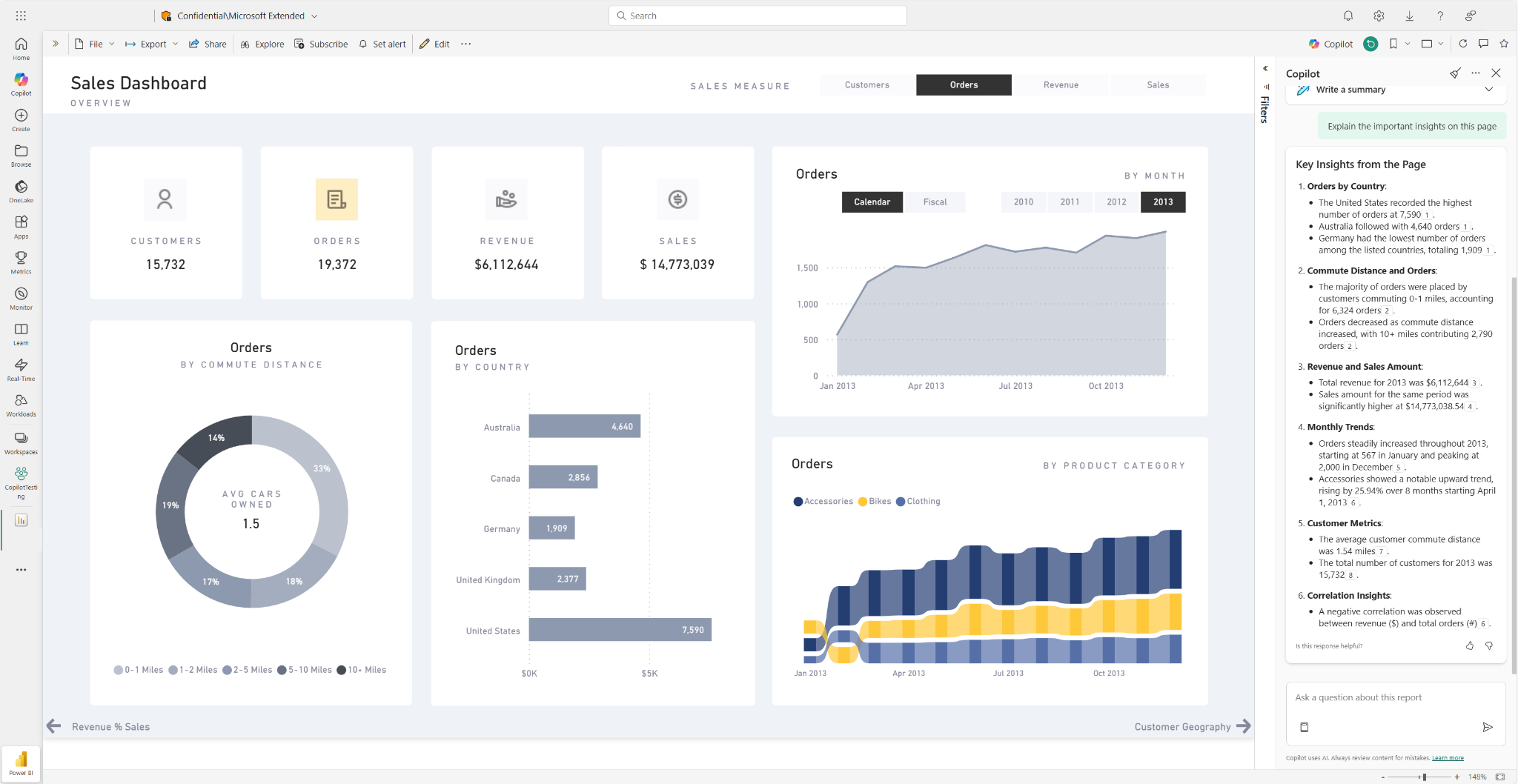
What it does: Power BI Copilot is an AI tool for data analysis that works inside reports, Power BI apps, and semantic models. It helps business users find answers in existing reporting, while report authors can create pages, summaries, visuals, and DAX queries from prompts.
Best for: Teams with a well-maintained Power BI semantic model, shared KPI definitions, and existing Fabric or Power BI Premium capacity.
Copilot gets its data context from the semantic model. Model descriptions, business terms, table names, and measures all affect how well it understands a question.
Microsoft recommends preparing the model for AI before rollout. That work matters most for teams with similar metric names, complex relationships, or recurring questions from business users.
Key features
- Report Copilot pane: Answers questions about an open report and summarizes report content.
- Cross-report search: The standalone Copilot experience can find and analyze reports and semantic models a user can access. This experience is currently in preview.
- Report creation: Generates report pages, summary visuals, and DAX queries from a prompt.
- Model improvement: Helps model authors identify unclear structures, inconsistent naming, and DAX improvements through Copilot in web modeling.
- Verified app answers: Supports author-prepared answers for common questions inside Power BI apps.
Power BI Copilot pros
- Copilot builds on metric definitions and business logic already present in a semantic model
- Business users can ask follow-up questions inside reports they already use
- Report authors can use it for DAX drafts, narrative summaries, and report-page work
Power BI Copilot cons
- Copilot needs paid Fabric capacity at F2 or higher or Power BI Premium capacity at P1 or higher
- The standalone Copilot and app-scoped Copilot experiences remain in preview
- Questions outside the semantic model can draw on general model knowledge, which makes prompt scope and review important
What users say
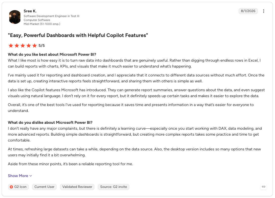
Pro: “What I like most is how easy it is to turn raw data into dashboards that are genuinely useful. Rather than digging through endless rows in Excel, I can build reports with charts, KPIs, and visuals that make it much easier to understand what’s happening.”
Con: “At times, refreshing large datasets can take a while, depending on the data source. Also, the desktop version includes so many options that new users may initially find it a bit overwhelming.” (Sree K., G2 Review, August 1, 2026)
Pricing
Power BI Free is free for creating reports, while Pro costs $14/user/month and Premium Per User costs $24/user/month, billed annually. Copilot needs paid Fabric capacity at F2 or higher or Power BI Premium capacity at P1 or higher. Pro or Premium Per User alone does not activate it.
Bottom line
Power BI Copilot is for the team whose reporting work already happens inside Power BI. If sales, finance, and marketing each use their own version of a metric, Copilot will repeat that confusion at speed. Clean up the model first, then give people the chat layer.
3. Tableau Pulse
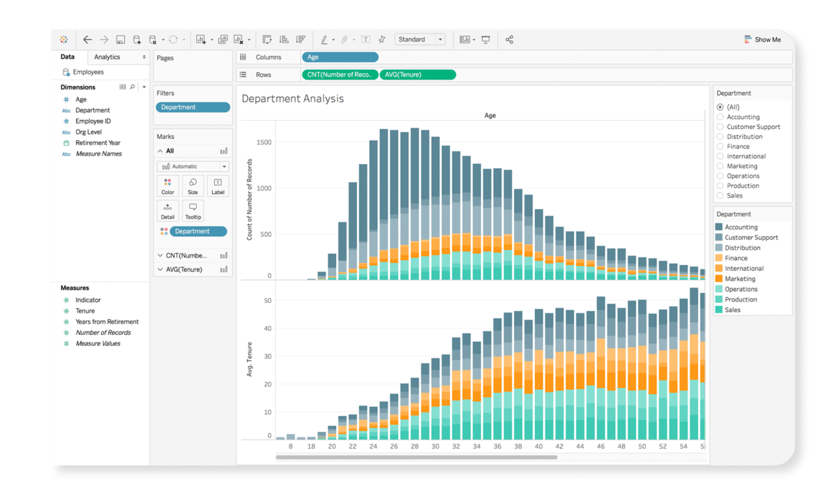
What it does: Tableau Pulse watches the metrics a user follows, detects changes that matter, and sends a short explanation through Slack, Teams, email, or Tableau Mobile.
Best for: Leaders who rely on a familiar KPI scorecard and want the relevant update delivered before they ask for it.
Tableau’s metrics layer sits underneath Pulse. That shared definition matters when the finance dashboard and the sales dashboard need to mean the same thing by “pipeline,” “revenue,” or “active customer.”
Pulse handles the regular briefing. Enhanced Q&A takes the conversation further by answering plain-language questions across multiple metrics, with explanations, supporting visuals, and citations.
Key features
- Proactive insights: Detects relevant drivers, trends, and outliers in tracked metrics.
- Metrics layer: Gives each tracked KPI a shared business definition.
- Workflow delivery: Sends Pulse insights through Slack, Teams, email, and Tableau Mobile.
- Enhanced Q&A: Supports follow-up questions across multiple metrics. This capability comes with Tableau+.
- Mobile exploration: Lets users open the full metric story from a Pulse digest on a phone.
Tableau Pulse pros
- Tableau Pulse is included with Tableau Cloud and Embedded Analytics editions
- The metrics layer keeps recurring KPI updates tied to common definitions
- Enhanced Q&A provides explanations, supporting visuals, and citations for multi-metric questions
Tableau Pulse cons
- Tableau Pulse is a Tableau Cloud feature. Tableau Server plans do not include it
- Enhanced Q&A requires Tableau+, which uses custom pricing
- Pulse depends on a stable set of defined metrics. Teams still debating their KPI definitions need that work completed first
What users say
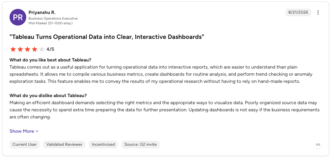
Pro: “Tableau comes out as a useful application for turning operational data into interactive reports, which are easier to understand than plain spreadsheets. It allows me to compile various business metrics, create dashboards for routine analysis, and perform trend checking or anomaly exploration tasks.”
Con: “Making an efficient dashboard demands selecting the right metrics and the appropriate ways to visualize data. Poorly organized source data may cause the necessity to spend extra time preparing the data for further presentation. Updating dashboards is not easy if the business requirements are often changing.” (Priyanshu R., G2 Review, August 21, 2026)
Pricing
Tableau Cloud Viewer licenses start at $15/user/month (billed annually). Every Tableau package needs at least one Creator license, which costs $75/user/month (billed annually) for Standard or $115/user/month (billed annually) for Enterprise. Pulse comes with Tableau Cloud, while Tableau+ uses custom pricing.
Bottom line
Tableau Pulse is for the executive who already has a KPI scorecard and wants fewer routine report requests landing in the analyst queue. It turns that metric routine into a short, contextual briefing. Teams still defining their core metrics will get more value from that foundation work first.
4. ThoughtSpot
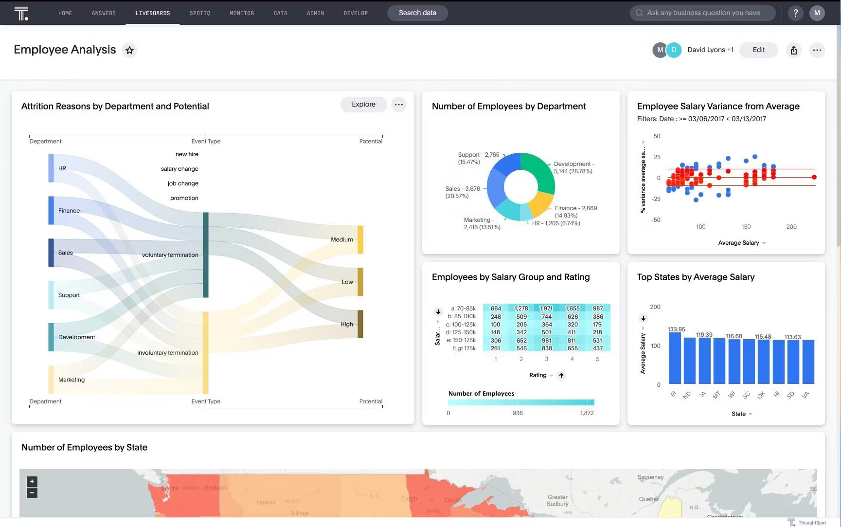
What it does: ThoughtSpot is an AI analytics platform built around search and its Spotter agent. Spotter turns a plain-language question into multi-step analysis, then generates charts, follow-up checks, and a traceable query behind the answer.
Best for: Business teams that want broad self-service analysis from a curated semantic model.
Give ThoughtSpot’s Spotter agent a question such as “Why did renewals fall in EMEA?” It can break the question into smaller checks, test the findings, and return an answer with supporting context.
ThoughtSpot grounds that work in its semantic and context layer. It translates natural language into search tokens tied to business definitions, giving analysts a traceable path back to the query logic.
Key features
- Multi-step reasoning: Breaks down questions, tests assumptions, checks results, and reruns analysis.
- Traceable query logic: Converts questions into search tokens connected to the governed semantic layer.
- Spotter Memory: Applies business definitions from trusted data models, conversations, and Liveboards.
- Automated change analysis: Surfaces highlights, summaries, and KPI changes without waiting for a new search.
- Action workflows: Can create Jira tickets, update Salesforce opportunities, post to Slack, or trigger enterprise workflows.
ThoughtSpot pros
- Business users can investigate a question beyond the first chart or summary
- Search tokens and traceable queries give analysts a review path
- Pro supports up to 1,000 users and 250 million rows of data
ThoughtSpot cons
- The quality of the semantic layer sets the ceiling for useful answers
- Pro includes 25 Spotter queries per user each month
- Essentials starts with five users, which can limit a small pilot
What users say
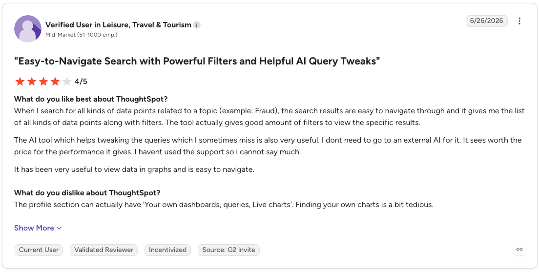
Pro: “The AI tool which helps tweaking the queries which I sometimes miss is also very useful. I don't need to go to an external AI for it. It seems worth the price for the performance it gives. I have not used the support so i cannot say much.”
Con: “The profile section can actually have 'Your own dashboards, queries, Live charts'. Finding your own charts is a bit tedious.” (Verified User in Leisure, Travel & Tourism, G2 Review, June 26, 2026)
Pricing
Essentials starts at $25/user/month (billed annually) for 5–50 users and up to 25 million rows. Pro starts at $50/user/month (billed annually) and supports up to 1,000 users and 250 million rows.
ThoughtSpot Analytics has no free tier, only a trial; the free Developer plan (up to 10 users, 25 million rows, one year) belongs to ThoughtSpot Embedded, for building analytics into your own product rather than internal analysis. Enterprise pricing is custom.
Bottom line
ThoughtSpot is built for the business team that keeps asking, “What changed, and why?” A clean semantic layer turns that search bar into governed self-service. A messy model turns rollout into another data-modeling project.
AI tools for natural-language analytics
These tools put plain-English questions at the center of the experience. They suit teams that want an analysis layer alongside their existing data stack.
5. Domo
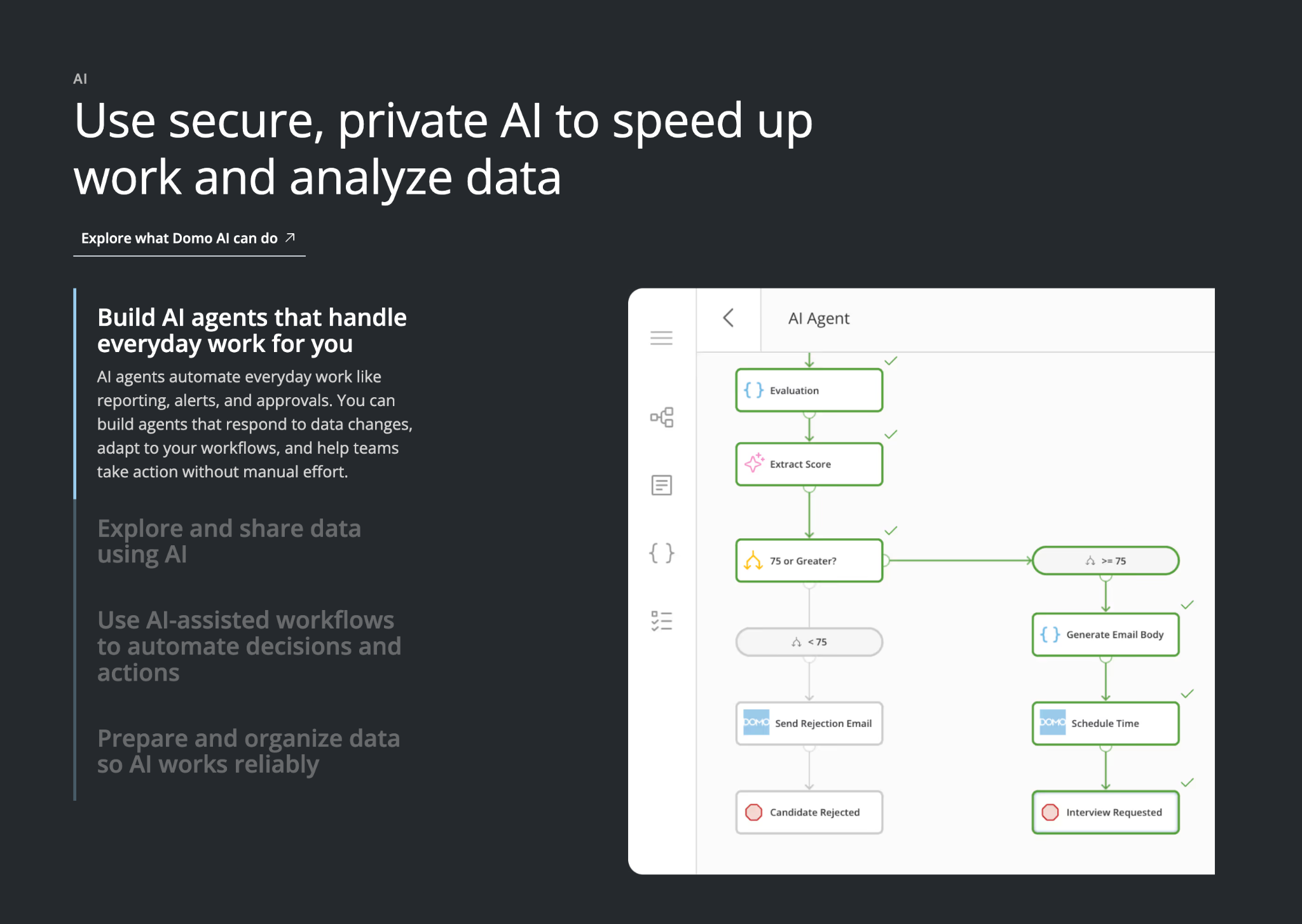
What it does: Domo combines dashboards, alerts, mobile access, workflows, and AI features for teams managing live business data.
Best for: Operations leaders who need to spot an issue and act while it still affects the day’s work.
Domo centers the experience on exceptions. A Domo Alert can watch a card or dataset, then notify the right person when a metric crosses a defined threshold.
Alert rules can define the trigger, message, recipients, notification frequency, and automatic action. That puts Domo closer to an operating console than a dashboard people check at the end of the week.
Key features
- Custom alerts: Watches Domo Cards and DataSets for defined changes or goal thresholds.
- Flexible notifications: Sends alerts by email, text, phone call, or the Domo mobile app.
- Alert Center: Collects triggered, suggested, and subscribed alerts in one place.
- Automated actions: Runs a defined action when an alert fires.
- Mobile access: Keeps dashboards and alerts available away from a desk.
Domo pros
- Teams can monitor exceptions without watching dashboards all day
- Alert rules can route a message or action to a specific owner
- The 30-day trial includes the full platform and unlimited users
Domo cons
- Domo publishes custom, consumption-based pricing
- Credit use can depend on storage, table updates, workflows, and advanced capabilities
- Teams that review a few KPIs at month-end may face more setup than the workflow needs
What users say
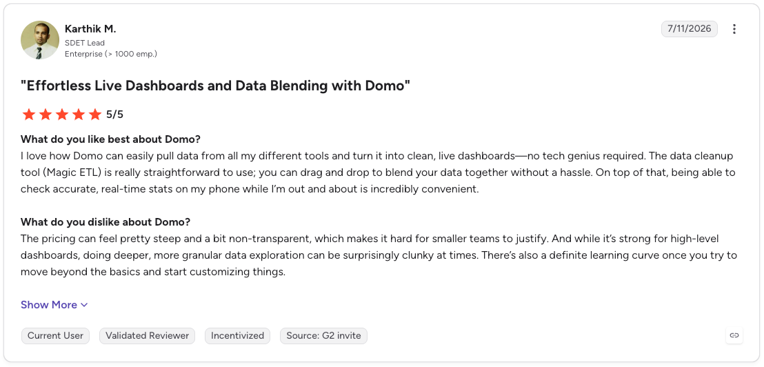
Pro: “I love how Domo can easily pull data from all my different tools and turn it into clean, live dashboards—no tech genius required. The data cleanup tool (Magic ETL) is really straightforward to use; you can drag and drop to blend your data together without a hassle.”
Con: “The pricing can feel pretty steep and a bit non-transparent, which makes it hard for smaller teams to justify. And while it’s strong for high-level dashboards, doing deeper, more granular data exploration can be surprisingly clunky at times.” (Karthik M., G2 Review, July 11, 2026)
Pricing
Domo uses credit-based pricing with no per-user charge. Credits cover actions such as data storage, table updates, workflows, and advanced capabilities. A 30-day free trial is available, with no credit card required.
Bottom line
Domo helps when a missed threshold needs attention before the next meeting. Teams running live operations, such as inventory, service levels, or campaign spend, can use alerts to keep the right people focused on the numbers that changed.
6. Tellius
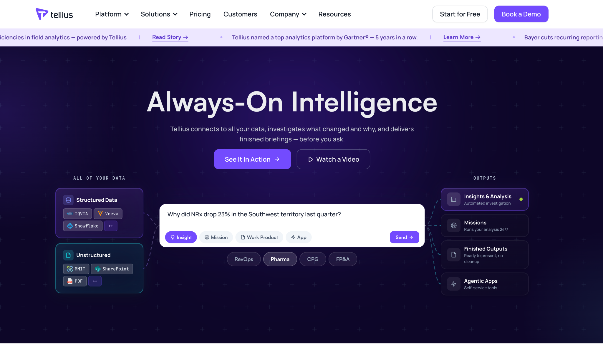
What it does: Tellius investigates what changed in the data, identifies likely drivers, and turns the findings into a visualization, briefing, or shareable analysis.
Best for: Analytics teams whose recurring work involves explaining a revenue drop, churn change, sales variance, or operational anomaly.
A red number starts a conversation. Tellius is built for the next question: What caused it? Its Kaiya agent can investigate a prompt or recurring mission, test drivers across connected data, and rank findings by impact.
Tellius also gives analysts a route back to the work. Search results include query transparency through visible SQL, while Guided Insights covers segment drivers, cohorts, trend drivers, anomalies, and outliers.
Key features
- Kaiya Missions: Monitors a defined question or metric and delivers scheduled briefings, alerts, and reports.
- Guided Insights: Investigates trend, segment, cohort, anomaly, and outlier drivers.
- Search query transparency: Shows the SQL behind a natural-language search result.
- Finished outputs: Produces visualizations, narratives, and shareable Vizpads for analysis.
- Enterprise deployment: Supports customer cloud, on-premises, or Tellius Cloud deployment.
Tellius pros
- Root-cause analysis sits at the center of the product
- Analysts can review the SQL behind a search result
- Kaiya can investigate a recurring mission and send finished outputs on a schedule
Tellius cons
- Tellius publishes no paid price
- Premium supports up to 10 users and up to 50 million rows in live mode
- Setup requires clear business context and connected data before an agent can investigate a metric well
What users say
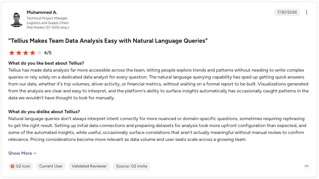
Pro: “Tellius has made data analysis far more accessible across the team, letting people explore trends and patterns without needing to write complex queries or rely solely on a dedicated data analyst for every question.”
Con: “Natural language queries don't always interpret intent correctly for more nuanced or domain-specific questions, sometimes requiring rephrasing to get the right result. Setting up initial data connections and preparing datasets for analysis took more upfront configuration than expected” (Muhammed A., G2 Review, July 30, 2026)
Pricing
Tellius offers a 30-day free trial. Premium and Enterprise use custom pricing, with Premium covering up to 10 users and Enterprise supporting unlimited users.
Bottom line
Tellius is a specialist for recurring variance investigations. A finance or RevOps analyst can set a Kaiya Mission to monitor a KPI, trace the drivers after a change, and send an annotated briefing before the weekly review. Dashboard-building teams may see less value from its agent workflow.
AI tools for data science and ML platforms
These two platforms handle work far beyond dashboard analysis. They support data preparation, model development, deployment, and governance for teams building AI systems.
7. Dataiku
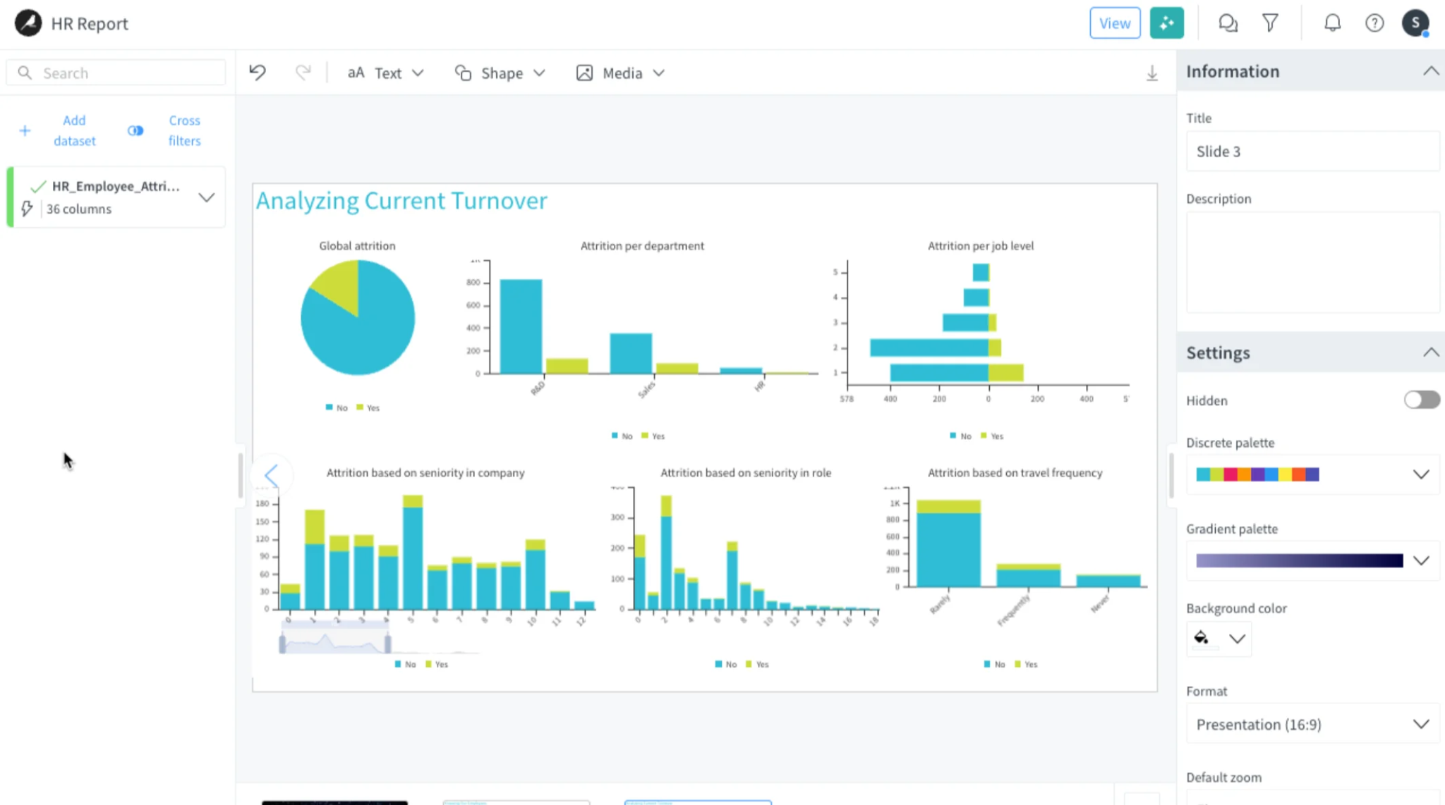
What it does: Dataiku gives teams one workspace to prepare data, build analytics and machine learning models, create AI agents, deploy them, and govern the work.
Best for: Large organizations that need analysts, data scientists, engineers, and business teams to work from shared data, rules, and review processes.
Dataiku acts as the common workspace behind an enterprise AI program. One team can build a visual data-preparation flow, while another writes Python or SQL, develops a model, or configures a multi-step agent.
The platform records the connections between data, features, models, and agent decisions. That matters when a data leader needs to answer who owns an AI project, what it uses, and how it reached production.
Key features
- Visual and code workflows: Supports visual recipes alongside Python, R, and SQL projects.
- AI agent development: Builds agents with prompts, tools, APIs, models, and human review steps.
- Dataiku Flow: Documents and versions data pipelines, transformations, and project dependencies.
- Model operations: Covers model validation, deployment, monitoring, and approval workflows.
- Central governance: Tracks lineage, ownership, risk controls, model performance, and AI usage.
Dataiku pros
- A shared workspace can reduce handoffs across analytics, machine learning, and agent projects
- Technical and non-technical builders can contribute through different build modes
- The platform supports deployment on existing data and compute systems, including Snowflake, Databricks, and Kubernetes
Dataiku cons
- The platform needs owners for access, governance, integrations, and project standards
- Dataiku publishes custom pricing for paid plans
- The free cloud trial excludes Dataiku Govern and advanced LLM Mesh features
What users say
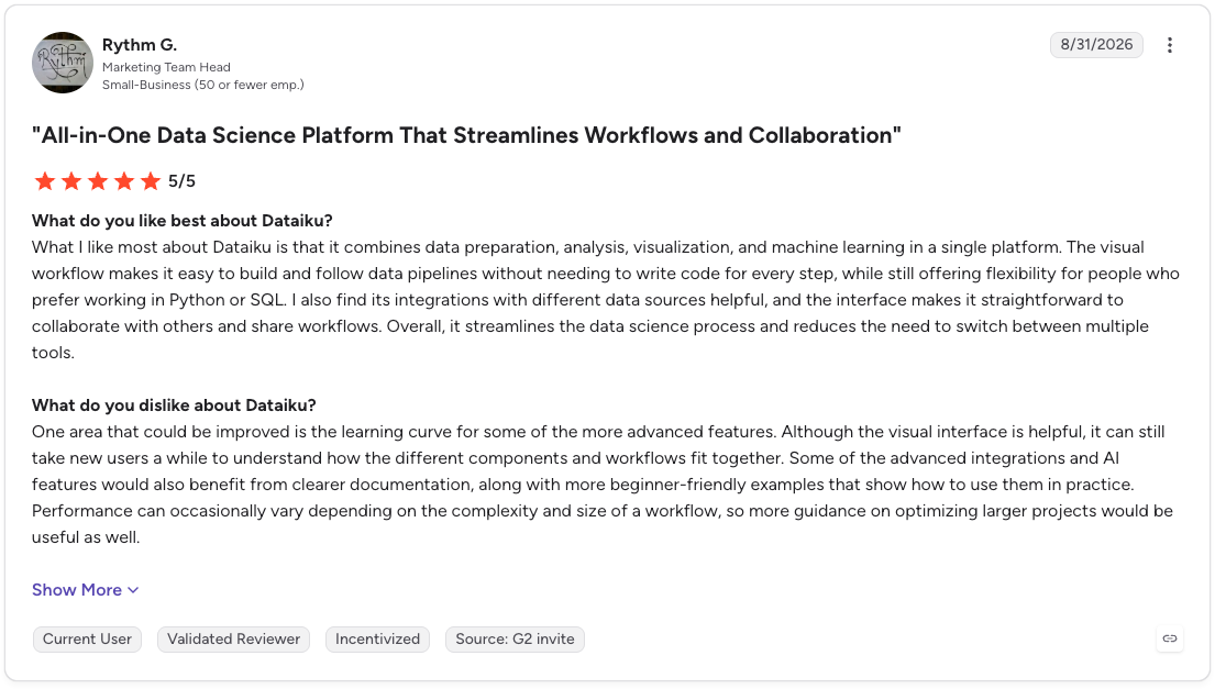
Pro: “What I like most about Dataiku is that it combines data preparation, analysis, visualization, and machine learning in a single platform. The visual workflow makes it easy to build and follow data pipelines without needing to write code for every step, while still offering flexibility for people who prefer working in Python or SQL.”
Con: “One area that could be improved is the learning curve for some of the more advanced features. Although the visual interface is helpful, it can still take new users a while to understand how the different components and workflows fit together.” (Rythm G., G2 Review, August 31, 2026)
Pricing
Dataiku’s Free Edition is available for self-hosted use. The managed cloud trial lasts 14 days and requires no credit card. Paid plans use custom pricing.
Bottom line
Dataiku becomes valuable when separate AI projects need to operate under the same rules. It gives a large team one place to trace the path from data preparation through model or agent deployment, which helps when work crosses department lines.
8. DataRobot
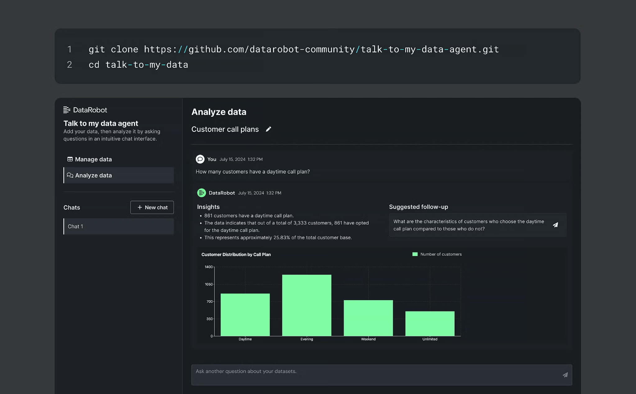
What it does: DataRobot prepares data, tests predictive models, explains their outputs, and deploys selected models into business applications.
Best for: Teams building recurring predictions for demand, churn, fraud, risk, or other defined business outcomes.
DataRobot treats a prediction problem as an experiment pipeline. Teams can clean and balance data, create features, test hundreds of model variations, and compare the results in one project.
Model accuracy is only part of the decision. DataRobot also provides feature-impact views, model documentation, bias checks, and monitoring for drift or prediction latency after deployment.
Key features
- Automated experimentation: Tests and compares hundreds of models and variations.
- Feature engineering: Detects, ranks, and transforms features for modeling.
- Time-series forecasting: Supports forecasts, cold-start modeling, nowcasting, and anomaly detection.
- Model explainability: Shows feature impact, effects, coefficients, and bias checks.
- Production monitoring: Tracks model health, drift, latency, and custom business metrics.
DataRobot pros
- Covers the path from model experiment to deployment and monitoring
- Supports GUI, Python, REST API, and notebooks for different technical roles
- Provides a 30-day free trial for testing predictive, generative, and agentic AI capabilities
DataRobot cons
- DataRobot publishes no paid price
- A team still needs a clear target variable, relevant data, and a way to validate model output
- Trial accounts support batch predictions and include limits for LLM calls and vector databases
What users say
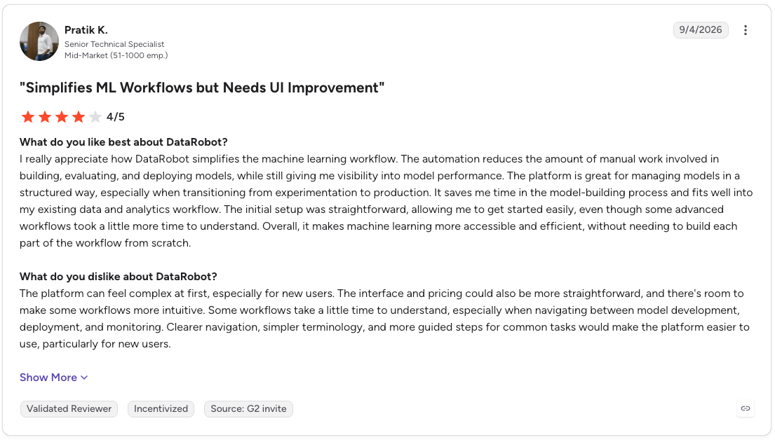
Pro: “I really appreciate how DataRobot simplifies the machine learning workflow. The automation reduces the amount of manual work involved in building, evaluating, and deploying models, while still giving me visibility into model performance. The platform is great for managing models in a structured way.”
Con: “The platform can feel complex at first, especially for new users. The interface and pricing could also be more straightforward, and there's room to make some workflows more intuitive. Some workflows take a little time to understand, especially when navigating between model development, deployment, and monitoring.” (Pratik K., G2 Review, September 4, 2026)
Pricing
DataRobot publishes custom pricing for paid plans. Its 30-day free trial includes the platform’s core features, with trial-specific usage limits.
Bottom line
DataRobot fits a team that keeps returning to the same prediction question, such as “Which customers are likely to churn next quarter?” It gives that work a repeatable model-development process, plus the tools to explain and monitor the result after it goes live.
AI tools for spreadsheet analysis
These two meet analysts inside the spreadsheet, where much of the day-to-day work already lives.
9. Julius AI
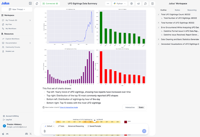
What it does: Julius AI analyzes uploaded files and connected data sources through a chat interface. It can generate charts, reports, statistical analysis, and plain-language answers from the data.
Best for: Analysts who need to get from a spreadsheet or CSV to a useful answer during the same work session.
A file lands in your inbox five minutes before a meeting. Julius gives you a quick way to ask what changed, find a trend, test a calculation, and turn the result into a chart or report.
The work can extend past file uploads. Julius connects to databases and warehouses, including Snowflake, BigQuery, Postgres, MySQL, SQL Server, Databricks, and Supabase. Its connectors run live queries from a natural-language question.
Key features
- File analysis: Works with uploaded CSV and Excel files for chat-based analysis.
- Charts and reports: Generates visualizations and exportable reports from a prompt.
- Live data connectors: Queries connected databases and warehouses through natural language.
- Scheduled analysis: Business plans include scheduled runs and Slack Agent use.
Julius AI pros
- File uploads provide a quick starting point for ad hoc analysis
- The free plan includes daily credits
- Paid plans add unlimited charts, exports, and access to connected data sources
Julius AI cons
- Credit use can rise as analysis, models, and team activity increase
- Shared production analysis needs agreed source definitions and review processes
- Business pricing starts at $450/month for teams
What users say
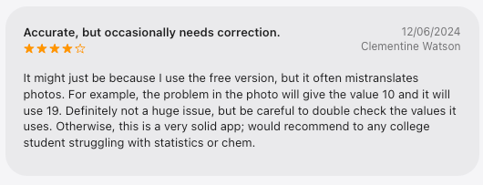
Pro: “This is a very solid app; I would recommend it to any college student struggling with statistics or chem.”
Con: “It might just be because I use the free version, but it often mistranslates photos. For example, the problem in the photo will give the value 10 and it will use 19. Definitely not a huge issue, but be careful to double check the values it uses.” (Clementine Watson, Apple Review, December 6, 2024)
Pricing
Julius AI has a free plan with daily credits. Plus costs $20/month, Pro costs $45/month, Max costs $200/month, and Business costs $450/month. Annual billing reduces each price by up to 20%.
Bottom line
Julius is handy when the question lives inside one file and the answer needs to arrive quickly. Its connector options also support live data analysis, though teams running shared, recurring reporting will need clear ownership of the data and metrics first.
10. Microsoft Copilot in Excel
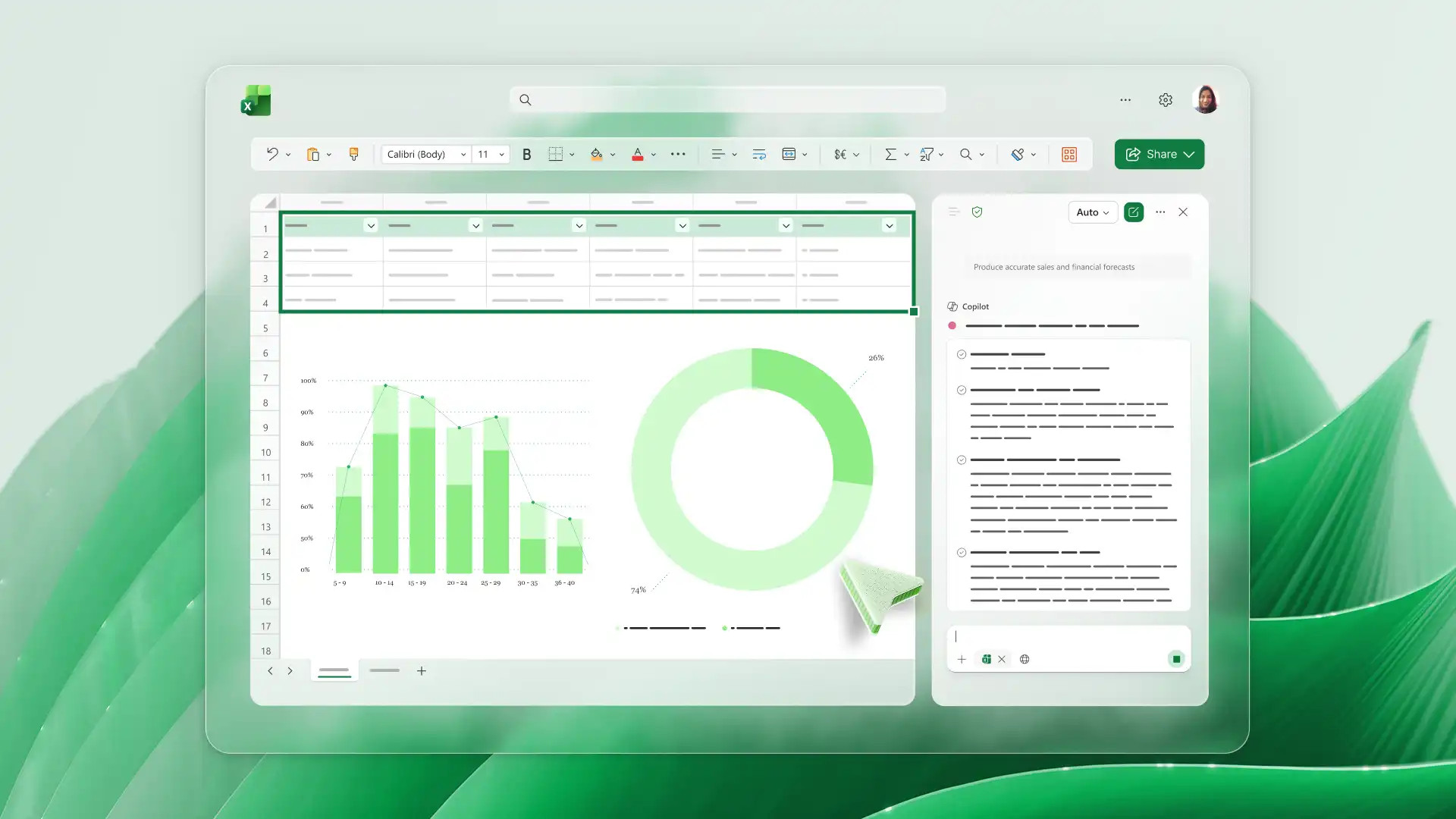
What it does: Microsoft Copilot in Excel uses plain-language instructions to edit a workbook, create formulas, build charts and PivotTables, and surface trends or outliers.
Best for: Finance, operations, and business teams whose day-to-day analysis already lives in shared Excel workbooks.
Copilot works with Excel’s existing tools, including tables, formulas, charts, and PivotTables. The changes stay editable, which gives the workbook owner a clear way to review and adjust the result.
Excel offers three ways to work with it. Edit mode changes the workbook, plan mode outlines the steps for approval, and chat mode keeps the analysis inside the Copilot pane.
Key features
- Formula and calculation help: Generates formulas and calculations across multiple sheets.
- Workbook editing: Updates sheets, formatting, data validation, cell ranges, and layouts.
- Charts and PivotTables: Creates editable visuals linked to source data.
- Data insights: Finds trends, outliers, summaries, and answers from workbook data.
- Plan mode: Creates a step-by-step approach before making changes.
Copilot in Excel pros
- Copilot works inside the spreadsheets people already share and review
- Edit mode shows workbook changes as they happen
- Plan mode gives users a chance to review a multi-step task before Excel updates
Copilot in Excel cons
- Full Copilot in Excel access requires a Microsoft 365 Copilot license
- Complex joins and shared metric definitions need a data layer outside the workbook
- Mobile access varies by device. iPhone and Android currently support chat mode
What users say
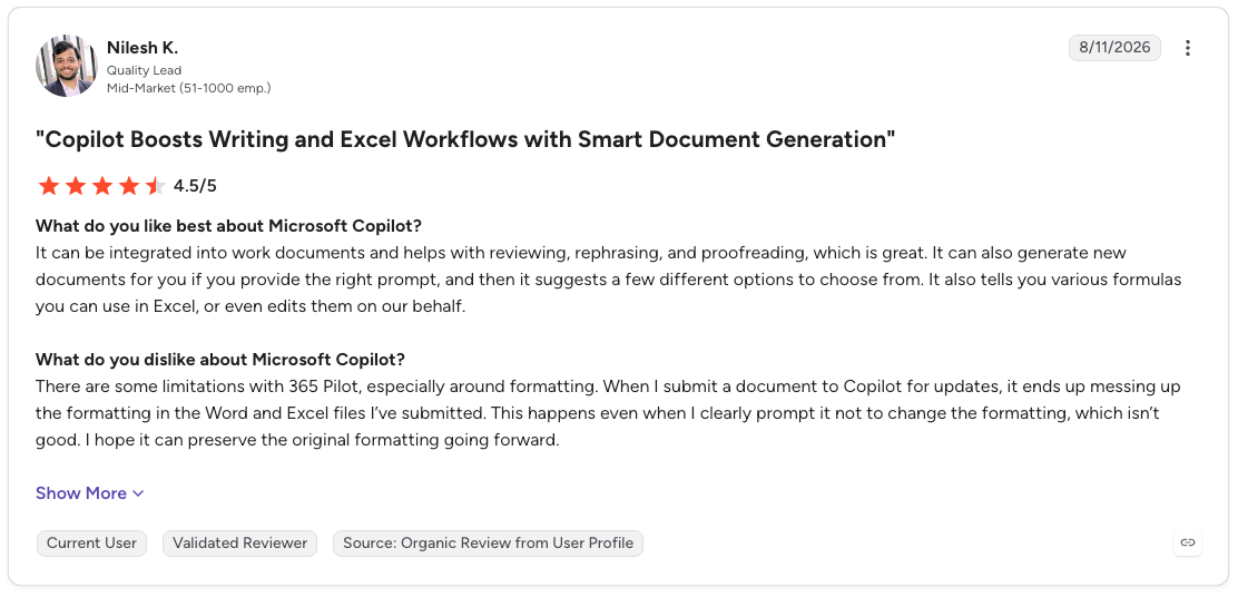
Pro: “It can be integrated into work documents and helps with reviewing, rephrasing, and proofreading, which is great. It can also generate new documents for you if you provide the right prompt, and then it suggests a few different options to choose from. It also tells you various formulas you can use in Excel, or even edits them on our behalf.”
Con: “There are some limitations with 365 Pilot, especially around formatting. When I submit a document to Copilot for updates, it ends up messing up the formatting in the Word and Excel files I’ve submitted. This happens even when I clearly prompt it not to change the formatting, which isn’t good.” (Nilesh K., G2 Review, August 11, 2026)
Pricing
Microsoft 365 Copilot Chat comes with eligible Microsoft 365 plans, though full Copilot features in Excel need a Microsoft 365 Copilot license.
Microsoft 365 Copilot Business costs $18/user/month on an annual promotion through December 31, 2026, for organizations with up to 300 users. It then costs $21/user/month. Enterprise costs $30/user/month, billed annually, and also requires a qualifying Microsoft 365 plan.
Bottom line
Copilot in Excel helps when the planning meeting, budget review, or monthly forecast already runs from one workbook. It can turn “show month-over-month growth by region” into an editable analysis without forcing the team to change tools.
A workbook becomes a fragile source of truth once many people maintain competing versions of the same metric. That point calls for a shared data model before adding more automation.
AI assistant for data analysis
ChatGPT is the general-purpose option here. It suits one-off questions that need custom analysis from a spreadsheet or CSV, especially when speed matters more than a shared analytics workflow.
11. ChatGPT

What it does: ChatGPT analyzes uploaded files through conversation. It can run Python calculations, create tables and charts, and explain the assumptions behind its analysis.
Best for: Analysts who need to investigate a messy or custom question from a spreadsheet, CSV, or other data file.
ChatGPT is useful when the question changes as you investigate. You can ask for a chart, spot an odd segment, request a different calculation, then ask it to test the next idea without rebuilding a dashboard.
Its data-analysis environment can write and run Python in a session-based Jupyter notebook. The code, outputs, and assumptions are available to review, which gives the user a practical way to check the work.
Key features
- Python-backed analysis: Runs calculations, transformations, and statistical analysis in a Jupyter notebook environment.
- Broad file support: Works with CSV, XLS, XLSX, JSON, XML, YAML, text, and PDF files.
- Charts and tables: Creates static or interactive charts, plus tables for row-by-row review.
- Connected files: Can attach files from available Google Drive, OneDrive, and SharePoint connectors.
- Method review: Shows the generated code, outputs, and assumptions for analysis tasks.
ChatGPT pros
- A free tier gives users a low-friction way to try data analysis
- Follow-up prompts support exploratory work and custom calculations
- Users can ask for a specific grouping, chart type, or statistical method
ChatGPT cons
- File structure affects the quality of the result; clear column names and one record per row work best
- The Python environment cannot make external web requests or API calls
- Chat-based analysis needs additional process controls for shared reporting and recurring decisions
What users say
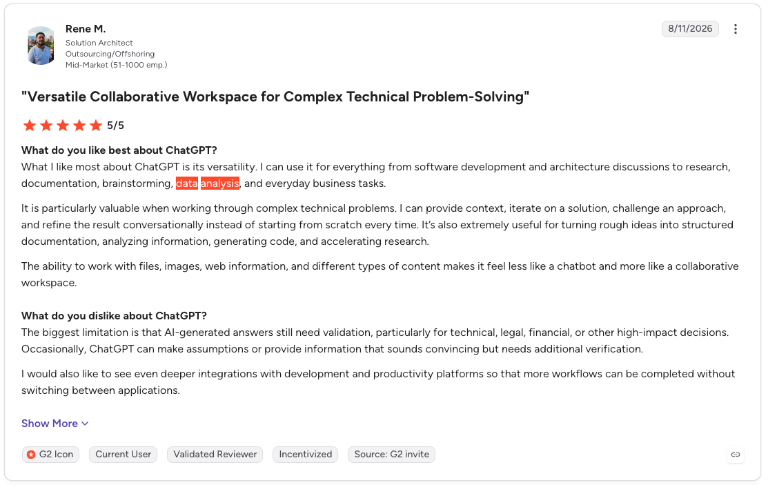
Pro: “What I like most about ChatGPT is its versatility. I can use it for everything from software development and architecture discussions to research, documentation, brainstorming, data analysis, and everyday business tasks.”
Con: “The biggest limitation is that AI-generated answers still need validation, particularly for technical, legal, financial, or other high-impact decisions. Occasionally, ChatGPT can make assumptions or provide information that sounds convincing but needs additional verification.” (Rene M., G2 Review, August 11, 2026)
Pricing
ChatGPT has a free tier. Go costs $8/month, Plus costs $20/month, Pro costs $100 or $200/month, and Business costs $25/user/month or $20/user/month with annual billing (2-seat minimum).
Bottom line
ChatGPT is at its best when a question gets more specific with each answer. It gives an analyst room to test a calculation, revise the method, and ask the next question without waiting for a reporting workflow.
Recurring business metrics call for a shared data model, permissions, and defined review steps.
Which AI tool for data analysis should you choose?
The AI tool you should choose depends on where the work slows down today. Start with the question your team asks every week, then look at the data, workflow, and review process behind it.
Choose Prophecy if data preparation keeps delaying analysis:
- Analysts spend time cleaning fields, joining tables, and tracing conflicting definitions before they can answer a question.
- Your team needs visible, governed preparation workflows for Databricks, Snowflake, or BigQuery.
- A dashboard problem traces back to raw source data or scattered transformation logic.
Choose a BI assistant if trusted reports already exist:
- Power BI Copilot fits Microsoft teams with a maintained semantic model and shared KPI definitions.
- Tableau Pulse suits leaders who follow the same business metrics and want alerts with context.
- ThoughtSpot gives business users a search-first way to explore a curated data model.
- Domo helps operations teams act on a metric change as it happens.
- Tellius helps analysts investigate the drivers behind a variance and share the SQL behind the result.
Choose Dataiku or DataRobot for production machine learning work:
- Dataiku brings analytics, models, agents, and governance into one shared workspace for large organizations.
- DataRobot fits teams with repeatable prediction questions, such as churn risk, demand forecasts, fraud, or loan default.
Choose Excel, Julius AI, or ChatGPT for flexible, file-level work:
- Copilot in Excel helps teams build formulas, charts, and summaries inside their existing workbooks.
- Julius AI offers a quick route from an uploaded file to an analysis, chart, or report.
- ChatGPT is useful when the calculation or method needs to change as the investigation develops.
Hold off on a new AI tool if the team still lacks a shared definition of key metrics.
A faster answer cannot fix a vague definition of revenue, active customer, churn, or pipeline. Agree on the source data and logic first, then choose the assistant that fits the work.
Final verdict
Prophecy fits teams whose analysis problems begin upstream, in raw data that needs to be cleaned, joined, documented, and governed before anyone opens a dashboard.
Power BI Copilot and Copilot in Excel are natural starting points for Microsoft teams. Tableau Pulse serves recurring KPI briefings, while ThoughtSpot serves business users who prefer asking questions over building dashboards. Domo focuses on live operational alerts, and Tellius focuses on root-cause investigations.
Dataiku covers broad enterprise AI and machine learning programs. DataRobot focuses more tightly on predictive-model development and operations. Julius AI and ChatGPT offer the quickest path from a file to an answer, though recurring reporting benefits from stronger data ownership and review controls.
Prepare your first dataset with Prophecy
Self-service data prep needs one clear path from a business goal to a production workflow. Prophecy gives business analysts that path while keeping the data platform team involved through visible logic, warehouse controls, and open code.
Describe the dataset you need in plain language. Prophecy’s Transform agent drafts a visual workflow, which you can inspect, refine, and validate before deployment.
- AI-drafted workflow: Describe the access, cleaning, and join logic your dataset needs. The agent creates a visual workflow that you can review step by step.
- Open code for deployment: Prophecy compiles the workflow into a standard dbt project with warehouse-native SQL, committed to your Git repository.
- Existing warehouse controls: Prophecy inherits your Databricks, Snowflake, or BigQuery permissions. Data processing runs on your existing cloud data platform.
- Validation before deployment: Each component is unit-tested before it appears on the canvas. You can also run a step, profile its output, and check for nulls or outliers.
Request a demo to explore governed data preparation for Databricks, Snowflake, or BigQuery.
Frequently asked questions
1. Which AI tool is best for data analysis?
The best AI tool for data analysis depends on the job and the data environment. Power BI Copilot fits Microsoft reporting, Dataiku and DataRobot support model building, and Prophecy prepares governed data for warehouse workflows.
2. Can ChatGPT do data analysis?
Yes, ChatGPT can analyze uploaded CSV and Excel files through Data analysis with ChatGPT, which writes and runs Python code. It works well for one-off exploration, custom calculations, and quick charts, provided someone reviews the code and result before sharing it.
3. How do I use AI to analyze data?
To use AI to analyze data, connect or upload the relevant dataset, ask a specific question, and review the output before acting on it. Check the date range, filters, and metric definition alongside any chart, statistic, SQL, or Python code.
4. How can I verify AI-generated analysis is correct?
To verify AI-generated analysis, compare the answer against the source data and inspect the tool’s filters, calculations, and query logic. A chart can look convincing while using the wrong date range, customer segment, or definition of a metric.
5. Are there free AI tools for data analysis?
Yes, free AI tools for data analysis include Julius AI, ChatGPT, and Prophecy Starter. Power BI also offers a free report account, though Power BI Copilot needs paid capacity. Free plans work well for testing a workflow before committing data, budget, or a team process.